YOOX Brand Book

System

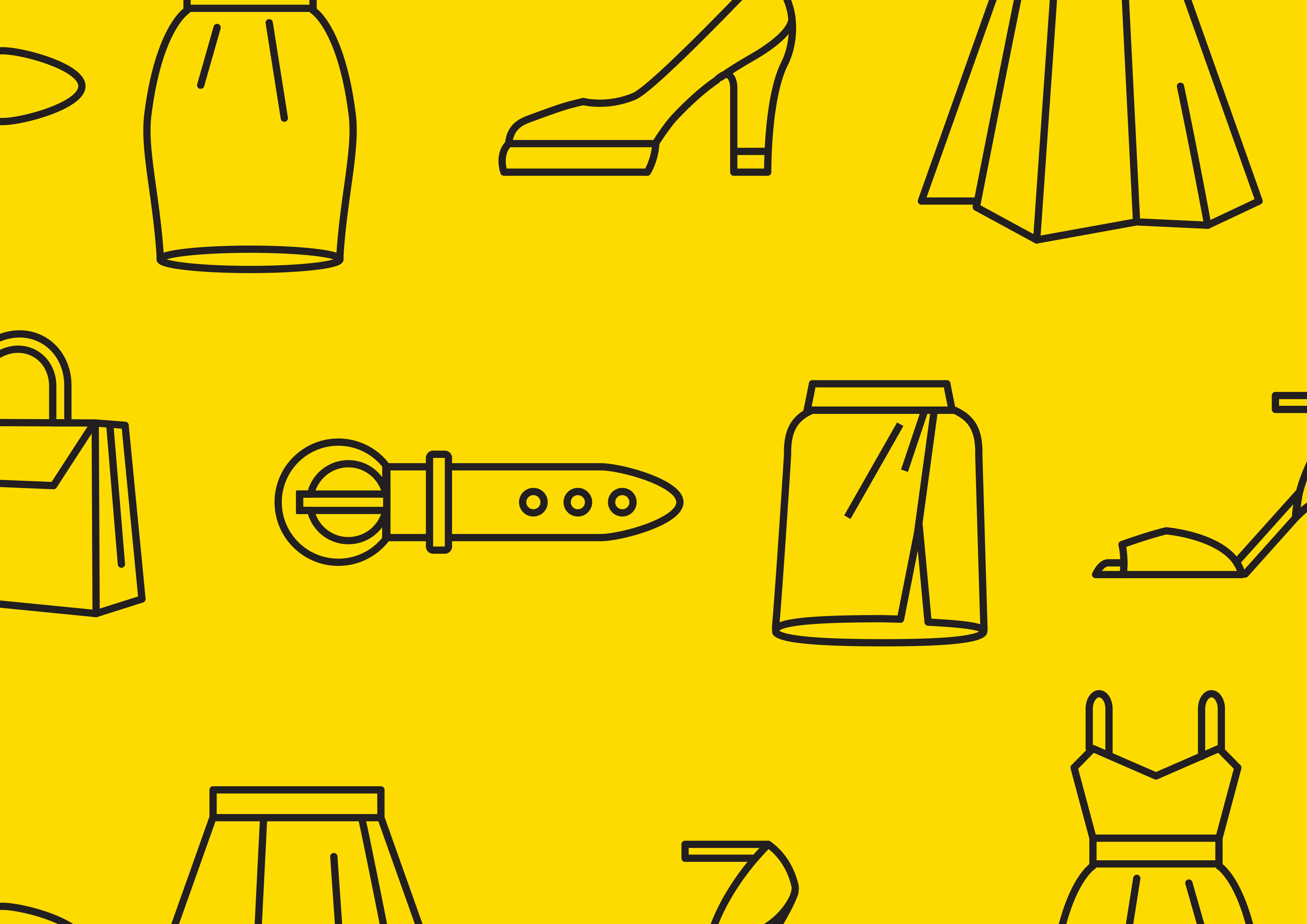
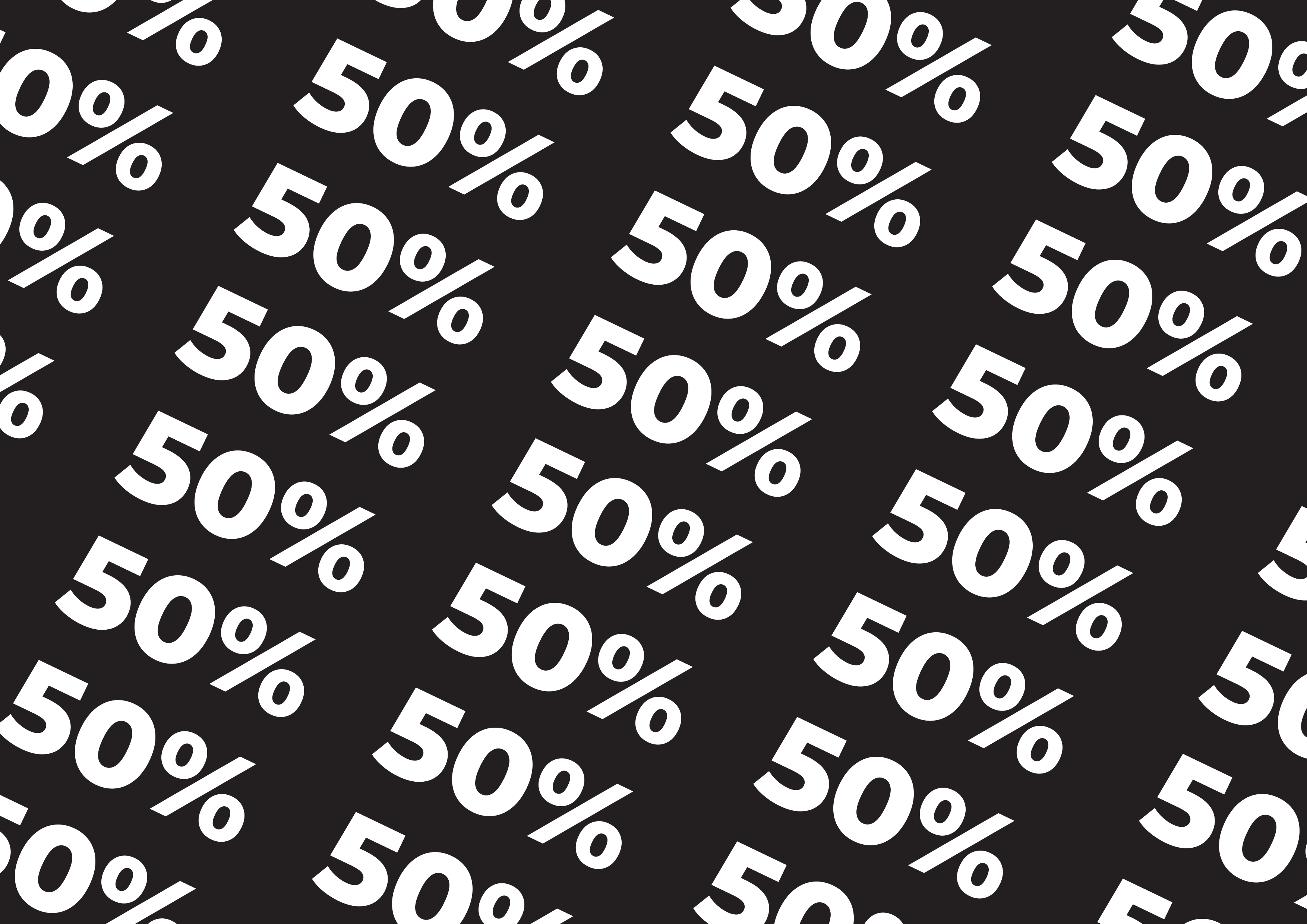
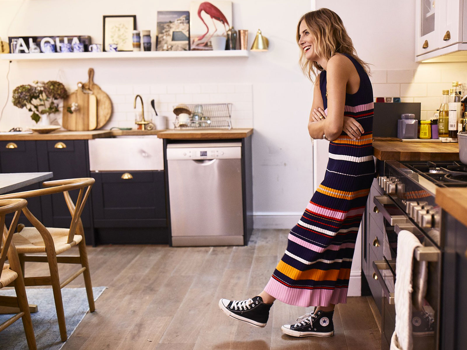
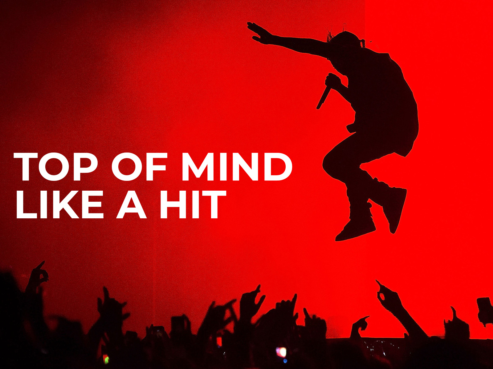
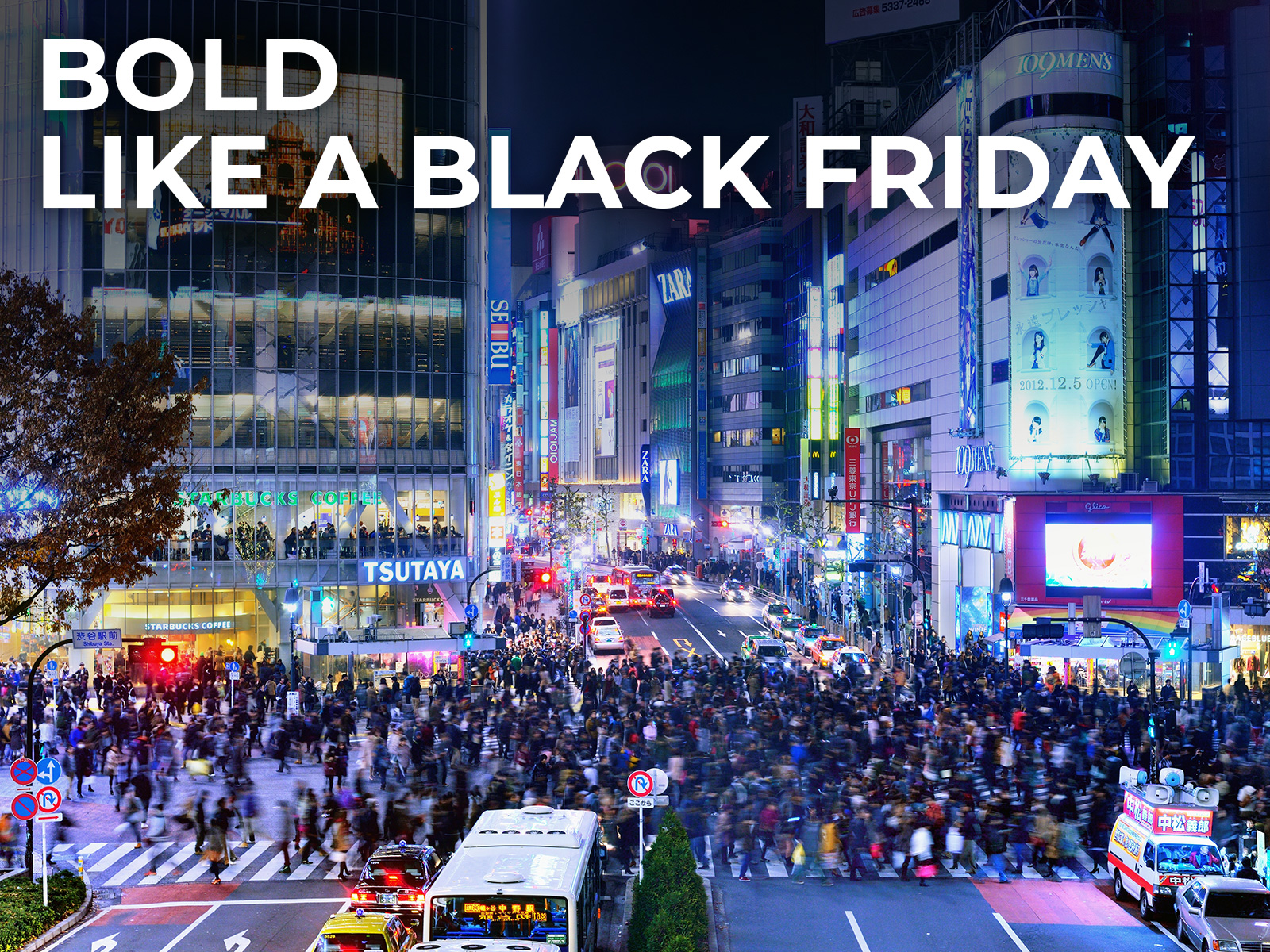
YOOX is one of the original innovators of online shopping. We wanted to build a system that could both serve business and engage our audience. Something that had to marry the brand with the products. It had to be variable yet systematic and consistent. A stream that could unify every touchpoint and let the brand be always recognizable. It had to be visually engaging, adapt to any format and hold up to interpretation by stakeholders around the globe.

Payoff

The tag-line is born from the strong legacy of the brand. It aims to drive YOOX communication to the future.

Legacy

In use

Composition

The staple of brand design starts from the logo and evolves out of the box.

YOOX Label

YOOX Dynamic Label

YOOX Dynamic Logo

YOOX Dynamic Format

Logo

Horizontal

Vertical

Typography

The sound of YOOX voice is a mix of style.

Montserrat

Guidelines

Typography Guideline

Color

#000000 is the YOOX black. And it’s not alone.

Primary

Secondary

Transparent

White

Transparent

Black

Transparent

Grey

Transparent

Yellow

Pattern

The soul of YOOX style: a mix of colors, iconography and typography.

Pattern 1
Pattern 2
YOOX Pattern
Pattern 3
Pattern 4

Iconography

It’s not a set of emotions. It’s a new proprietary communication tool to share info in an entertaining way.

Icons

Icons

Motion

Always delighting eyes and hearts with videos, photos, images, gifts and more.

Transitions

In use

Art Direction

The only way to match fashion, art and design with life.

Photo

Experience

40% Experience

Device

40% Digital Shopping Experience

Hero

10% Faces

Texture

10% Textures

Illustration

Just one principle: start from the white and go on simply.

In use

Netiquette
App Download

Netiquette

App Download

Animation

Tone Of Voice

When you find the words you need to know how to use them.